Monday, 31 October 2016

Profiles in Nonsense: My Favorite Martin


The Encyclopedia Snarkiana defines a Barrister as someone who tries to appeal to the Beaver’s pride, vainly citing a number of cases in which making laces has been proved an infringment of right.

Lewis Carroll, the author of those lines, further elaborated upon them by providing the Barrister with a ready-made dream to occupy him with in Fit the 6th. This dream was also furnished with a snappy soundtrack by Messers Gilbert and Sullivan and a full supporting cast of judge, jury, witnesses and defendant. The oneiric defendant (and substitute judge and jury) was none other than the Snark itself, which led to a bit of what well-oiled jurists call a conflict of interest. The Snark’s legal status as a nonexistent, fictitious and nonsensical creature can be best summed up as being Nothing, and nothing, ladies and gentlemen of the jury, comes from Nothing.

This illustrator chewed over that legal, ethical and even metaphysical conundrum for quite a while when he was first looking about for someone to cast in the role of the Barrister. After countless auditions with aspiring non-entities ranging from obscenely wealthy middle-class American politicos to an entire gaggle of opiated American radio talkshow intellectuals, I threw my hands up in the air in despair. It was impossible, finding someone who could encapsulate the very essence of Nothing so thoroughly that it even permeated his dreams!

At that moment, the door opened and a sweaty and rotund German intellectual eased himself and his moustache onto The Hunting of the Snark’s rather tatty casting couch. It was Martin Heidegger, the notorious Continental philosopher and Black Forest gadabout. It turns out that good ol’ Martin had spent considerable ink and governmental educational subsidies bloviating ad nauseam on the subject of Nothing. It seems like everywhere Martin looked, in the kitchen, in the shower, behind the sofa, there it was, the bane of Existentialism — Nothing!


Of course, he had a fancy German name for it, curious readers can read all about it and much more here, but in short, Martin was our man. The fourth member of the B-Boyz, the Barrister, was going to be Martin Heidegger! Exhausted by the search, I lay back and lit up a hand-rolled Brazilian samba girl. Things were back to normal at Chez Snark, Nothing was working its nonsense mojo once again.

Monday, 24 October 2016

Profiles in Nonsense: Nietzsche's in Drag and I'm Feelin' Blue

We continue my GN Snark's Dramatis Personae with this week's specimen … the Maker of Bonnets and Hoods, or as he's known to the authorities, the Bonnet. Curiously, this character is given almost nothing to do in the epic, except for a brief episode in Fit the Fourth where he allows someone to chalk the tip of his nose. Other than that, not a peep, which poses obvious problems for an illustrator trying to flesh out this nonentity.

One might even say that the Bonnet poses us an existentialist problem, perhaps even a protoexistentialist problem of sorts. Luckily, the persona of Friedrich Nietzsche, the notorious Continental steamer, was available on short notice and we gladly inducted him into our Fellowship of the Snark, moustache and all.

We see him above, as he appears in Fit the Second of our version of The Hunting of the Snark, leering at the HMS Snark in a nautical manner. I think he looks rather fetching in his big bonnet, don't you?


No doubt the more well-heeled aficionados of Lewis Carroll, and Western Civ in general, are having a quick apopleptic fit upon seeing all of this. Why, they wonder aloud over their breakfast scotch-and-cornflakes, did this artist feel it necessary to clothe the persona of the Bonnet-Maker in the fleshly lineaments of the Prussian demiexistentialist Nietzsche?

Was it the leather, the machismo, the whips and such-like that Nietzsche was wont to bandy about when talking of women, a bandying which he not only spoke of in print but would even indulge in personally right in front of a camera operated by — yow! — a man named Bonnet?


And so … have we hoisted Nietzche upon his very own petard here, a petard which the philosopher had himself loaded with the scattershot observation that there are no facts, only interpretations? Have we stooped so low that we must rely upon the flimsiest of nominal accidents to populate our Hunting of the Snark?

Or is it just a petty bit of passive-aggressive revenge by an inkster who still suffers from debilitating bouts of Post-University-Philosophy-Course-Syndrome, an illness which can only be controlled by long-term exposure to Carrollian Nonsense and in severe cases, repeated applications of Three Stooges shorts?

In short, there’s nothing going on here at all, folks, just a guy with a moustache wearing women’s clothes, a guy who knows that to become what one is, one must not have the faintest idea what one is.

Monday, 10 October 2016

Profiles in Nonsense: Snark-fishing in the Yemen with the Bellman

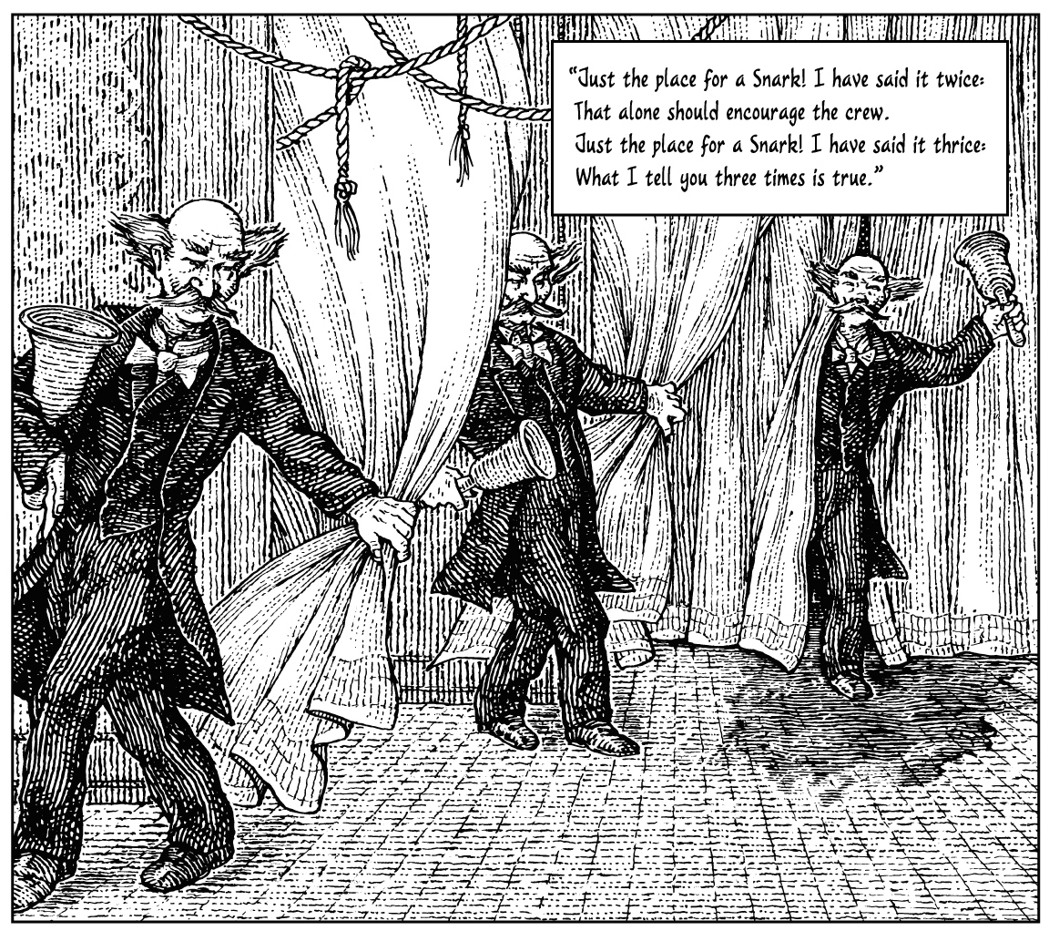
I've been remiss with my Snark blog and I apologize. As penance, I present what I call "Profiles in Nonsense," a series of postings focusing on the ten Snark Hunters (AKA B-Boyz), beginning with the Bellman, the presiding genius and master of ceremonies of Lewis Carroll's Hunting of the Snark.

Readers who care to do so may remember that the Bellman appears in the very first line of the Snark, crying: Just the place for a Snark! This is of course, a tautology (and a rather clever parody of the traditional Homeric invocation of the Muse) and not the first which this avuncular, cozily insane personage will commit. Other Snarkologists have already pointed out that the Bellman may well have been based on an eponymous officer at Christ Church College, "Le Bellman", whose job it was to ring a bell whenever some particularly inert don had finally popped off for good.

Of such grim details are both great poetry and academic life made! An insane man armed with a large, blunt, heavy metal-and-wooden object with which he roams our poem and Oxford alike, announcing the beginning of the verses and the ending of some other poor college-wallah's life. No wonder this illustrator saw fit to flesh out this lugubrious person's person with the above drawing.

The sharp-eyed reader who eats his carrots will instantly ferret out, in his offhand, weaselly ferret-like manner, the fleur-de-lys motif lurking in the wallpaper. This outbreak of French monarchism has been induced by the Bellman's notorious insistence upon the Rule of Three which occurs immediately afterwards in the same opening stanzas:

Just the place for a Snark! I have said it thrice:
What I tell you three times is true.

Such pronouncements reek of royal diktats to this artist's ear; and furthermore, the trefoil motif nicely complements the trinitarian obsessions of what we now call the Clochetic Rule of Three. Learned Snarkologists have found all manner of historical riffraff lurking inside this Rule: a reference to a Victorian mathematical classroom crib, perhaps a jab at the Mad Monadist, Charles Peirce and his triunary blatherings, or it could even be a clever Protosurrealist, anti-anachronistic reference to cybernetics and human cognition and crypto-Catholicism.

But we here at Chez Snarque are made of sterner stuff! We think that the Bellman is nutters because he just is, and we've dug up some really cool facts to support our Nutter Theory. Firstly, the Bellman's odd physical appearance is based upon that of Sir John Tenniel, the quick-fingered illustrator of both of Carroll's Alice books, and a rascally bon vivant, to boot!

SIR JOHN TENNIEL
Secondly, Sir John's illustrations for Carroll included several drawings of the White Knight, that avuncular, cozily insane personage who assists young Alice in her regal quest (zut! more monarchism!) in Through The Looking Glass. Well-oiled Carrollians will grunt appreciatively at all this, knowing that the White Knight was a stand-in for Carroll himself, who was notoriously shy about being bruited about in public as a avuncular, cozily insane personage.

Which leads us to our third observation, and hence, owing to the Clochetic Rule of Three, our self-evident, truly definitive and tyrannically final royal diktak upon the entire matter: the following drawing by Sir John of the Admirable Carroll in mufti as a White Knight who bears an uncanny resemblance to a certain Bellman trying pass himself off as — gasp! — Sir John Tenniel disguised as a certain Christ Church don named Charles Lutwidge Dodgson who had a penchant for going out in public as none other than — gasp again! — Lewis Carroll!


THE WHITE KNIGHT … OR IS HE?

Well, I think that just about wraps it up for both the Bellman's little scheme of trinitarian cross-dressing and more importantly, for whatever little standing I still possess amongst legitimate Carrollian circles.

No, no applause, please, I have more simple tastes. Just rattle your kippered herrings or something like that, I'm off for a nice lie-down with some hot-gin-and-nautch-girl-compresses. I feel a lynch mob coming on …

Monday, 12 September 2016

Illustrating The Gentleman … I ink, therefore I am


Another process post for one of the 17 pictures I did for Forrest Leo's novel, The Gentleman

Books about books are always fun and The Gentleman is very much about other books: Dante, Tennyson, James Cabell, the entire  Beerbohm/Wodehouse cabal, it's all grist for this particular literary mill. Which brings us to Chapter 6, where the two main protagonists meet for the first time. Naturally, they meet in a bookstore whilst drinking tea (what else?) and it's not any ordinary bookstore, it's Tompkin's Bookstore, an emporium of all that is recondite and obscure and generally very cool about books and reading.

Here's my rough thumbnail, final pencil and final inks for this chapter … a stonehenge of biblioliths from which the inventor Kensington emerges, lit by a single spot, in the approved Gustave Doré manner.

Like certain North American chain bookstores, Tompkin's Bookstore also sells the usual accessory tchotchkes and fanfreluches, but not of the dreaded scented candle type, no, Tompkins only offers the finest oneiric baubles and creatures that dreams can buy.

And dreams are really what books (and books about books) are all about. They are the universal, biological template of storytelling and more to the point, they are stories told by the same person that they are meant to entertain, a recursive ploy similar to drawing a picture for a book-about-books.

Pretty heavy stuff for a book about sending one's wife to hell but I draw 'em as I see 'em, with eyes wide shut.


Tuesday, 6 September 2016

A Slap in the Face: the illustrative process behind The Gentleman

Instead of the usual Snark blather, I think that a process post would make a nice change. I recently did 17 illustrations for Forrest Leo's novel, The Gentleman, just published by Penguin/RandomHouse, and here's a look at a full-page I did for Chapter 2.

The novel is a bit hard to classify, which is always a good thing … a multi-homage to James Cabell, P.G. Wodehouse, various steampunk illuminati and even such recondite corkers such as The Diary of a Nobody and Augustus Carp. Set in a slipstreamed 19th-century, the story involves the romantic intrigues of a young poet who has accidentally consigned his young bride to hell. There's lots of steam-powered ornithopters, pistol duels, satanic visitations, cool Victorian womenswear and more to my point, both the author and the editorial team (Ed Park editing, Claire Vacarro art directing) were keenly aware that James Cabell's illustrator was none other than the late, great Frank Papé.

That posed a conundrum for this illustrator. Papé tended to go for a very Symbolist handling of his material and although Forrest was certainly working the same Cabellian vein, he had wandered off in a more Victorian steampunk direction. I felt it best to emphasize the Victorian feel with a faux wood engraving style of rendering plus a more sedate Victorian style of design. Melodrama on a stage within a defined picture frame, that's the way they liked it back then. Which is where this process post kicks off: the initial thumbnail concept for a scene illustrating the young hero-poet being soundly slapped by his angry sister in the presence of their much-suffering butler.

The Victorian illustration is a theatrical picture space, ie., no funny angles or odd positioning of actors, just a 3-D volume seen head on through a normal picture plane, as if we are in the front row seats. Hence the reaher sedate composition of this thumbnail. Emotion would be concentrated in the sister's about-to-slap hand and also in the books literally flying off the shelves, The scene is set in the hero's library and that was a major theme of the novel: it was a novel about many other novels (and poems) and I wanted to emphasize this visually.

The text box at the bottom was for Claire's initial idea of running a title cartouche at the bottom of every full-pg illo, in the true Papé spirit, an idea she later dropped. In any case, the main thing was the thumbnail was clearly Victorian in feel and gave full scope for lots of Easter eggs.

I'd like to note that this thumbnail concept was probably the 4th or 5th idea I had for this picture, it's really important to not be satisfied with your first or even second idea, it's usually best to sleep on it and come up with more ideas, for several days if possible and eventually, things will work out for the best. This is the great advantage of book illustration, you have the time to think at length. And nap between thumbnails, that's always nice, plus lots of tea, that goes without saying.

After approval of thumbnail, I did a tight pencil on vellum, focussing only on outlines. Sometimes I do a value study, usually in Photoshop atop a scan of the pencil but I didn't on this picture. On reflection, that was a mistake on my part. In any case, Ed and Claire seemed happy with this pencil and as far as the values went, there was only one possible solution: a background of about 40%K, going from light to dark as the page descended to create a  theatrical effect (something Gustave Doré often did to great effect) and everything else high-contrast, with shadows about 75%, a few midtones at about 25% and sufficient blown-out highlights.

This pencil was about 20, 30% larger than my final inking, which I did from a reduced scan of the pencil. That final inking was still about 15% larger than the final print version. My eyes are tired and my hands arthritic, every square inch hurts. I ink on denril, a synthetic vellum, with acrylic ink, using dip nibs, on this job, Gillot 1950 for the tight lines and Brause 66EF for the heavier lines. Really tight hairlines were done with a Hunt 104. I use a floating, illuminated magnifying lens while wearing a specially prescribed pair of coke-bottle lensed glasses designed to magnify at 20 cms. I like to ink very tight and very clean. When this job was done, I had some posters made of the art for promotional purposes, the inking easily blew up to 400% while looking very crisp and optically balanced.

Using dip nibs is mandatory for serious, complex inking and any inker who thinks that they can get away with felt-tips is only kidding themselves, their inking will always lack snap and energy. The constant swell and contraction of the dip nib conveys the movement of the hand and wrist, which is the essence of good inking. I also avoid using scratchboard for the same reason, the scraper blades cannot flex, giving the line work a mechanical feel. Sometimes that's necessary but frankly, I loathe it. As for digital inking … my opinion of it is unprintable.

Here's the initial inking. I had deleted the snakes with my electric eraser (another advantage of using Denril, it's easy to erase and re-ink), they simply weren't working. In fact, the entire drawing was not making me too happy, it lacked energy. The slap in the face was lost in a maelstrom of lines and shapes. It was time for a painful re-evaluation of the situation. Also, half-way through the inking, Ed and Claire realized that my rendition of the sister's face was not quite right for the text. I was making her too tarty and too old … ah, middle age, when all romantic hullaballo is but a sound and fury signifying nothing.

But they were right, she wasn't quite on the mark. Every book you illustrate involves a drift away from the text towards your own ideas on the same material, and sometimes that drift works and sometimes it doesn't. In any case, this picture was a problem child (the fact that it was the first picture I inked was part of the problem, you tend to warm up conceptually and physically as you go along).

And so, dear reader, I cropped it. Thank the gods of obsessive inking that I had the extra space and size to make it work in the trim size. I also inked a new head, can't remember if I did it on this drawing or a separate piece of Denril, but in any case, here it is: A Slap in the Face, Redux.

The butler gone, the serpents vanished, the sister had a face-lift and I had tossed away several painful hours of inking (I estimate about 24 man-hours for the whole page) but now things were pulling together. I had sacrificed the faux Victorian feel for a more modern crop but it had salvaged the picture's story and that is the bottom line in illustration: every line you draw must have a genuine function. It must advance the story and also serve a necessary structural purpose. Inking to fill space is a heinous affront to the gods of freelance, they like your pages to work hard for the money. The more you put into the page, the more it gives back to the reader and that makes for happy readers and happy editors. When everybody is selling less for more, such strategies pay off handsomely.

To sum up for the jury, every line must have a purpose and every white space also. The primary purpose is narrative, the secondary is optical pleasure, which is the same thing but on a more visceral level. Never hesitate to spend extra time on a picture, no matter the client. Do a lot of thumbnails, pencil thoroughly to cover all inking contingencies and no matter your inking style, take the time to make it look the best you humanly can at that moment in your development.

On a final but inevitable mercenary note, if anyone wishes to purchase some of the original art for this book, drop me a line … mahendra373 at hotmail dot com. Support the arts by supporting my need to nap and drink tea between inking bouts! Aye, work is the curse of the inking classes.

Monday, 15 August 2016

The snark in the grey flannel suit

Wipe the smirk from your face, dear reader, stifle the groan in your throat … yes, we are punning today and the punnee is a legal suit and the punnor is a gentleman’s suit, size 42.

Of course, you already know that puns are the bittersweet linguistic memory of that long-ago time when any word meant anything, and some of ‘em meant as much as six different things before breakfast. In those prelapsarian times when language was first evolving from the sonic ooze of grunts and snorts into more upright, ambulatory fricatives and uvular trills, the assignment of one particular sound to one particular object was a slapdash, fritter-my-wig sort of business. In truth, we might say that once upon a time all words were puns and Nonsense reigned upon the land.

All of this came to a sticky end with the invention of reeling and writhing, as I’m sure you’ve heard before. Equipped with such skills, even circus and theater folk could interpret the written marx of contract law and stymie the Pig and his legal Snark, all by invoking the Sanity Clause.

What’s this, the Judge sputters! Sanity Clause? You can’t fool me, there ain’t no Sanity Clause! Exactly, milord, 'tis the perfect Christmas Alibi, the Snark replies!

Monday, 8 August 2016

The color of money is SNARK

The coin of the realm these postlapsarian days seems to be the last and greatest bastion of that very same unblinking faith in the unseen which characterized the salad days of the Middle Ages. Nowadays, most governments print and mint the stuff by the bushel with nothing more to back it up save a vague promise of an tattered xerox of a smudged fax of a unfocussed photograph of a crude drawing of a shifty rumour of someone, somewhere, actually doing something of value sufficient to prop up the coin in question.

However, in the Nonsense world of Lewis Carroll, and more to the point, in the Barrister’s Dream of the Hunting of the Snark, we find a refreshingly hard-nosed, Victorian mentality vis-a-vis whatever coin of the realm you might be trying to palm off on the locals. Messers Carroll & Dodgson had a healthy respect for money, struggling as they did to support various spinster sisters (AKA spinsisters in certain musical circles) and even the odd charity case on an academic’s meager salary. The Snark’s pooh-poohing of the charge of Insolvency on the part of his piggish client would have struck a chord with Carroll & Dodgson.

The Snark’s defense of "never indebted" must come as a vindication of sorts to the Pig, whose depiction here as a piggy bank will no doubt amuse the simpler-minded reader. Giant, auspicious pigs with financial and psychic clout were once all the rage in certain mythical, Celtic quarters and such cheap visual sleights-of-hand are this artist’s inky stock-in-trade.

But the Barrister would also like to draw your attention to the chorus line of Martin Heideggers who are shimmying seductively to the delightful tune of When it Rains, It Rains Pennies From Heaven. It’s a comforting melody composed to allay the Judge’s crypto-Calvinist suspicions of any rumored pay-offs emanating from Upstairs and to also lull the Jury into contemplating the possibility that the Pig isn’t responsible for his actions since Society Made Him Do It Anyway (a legal defense employed, curiously enough, by the real Martin Heidegger).

But what’s this, the Judge sputters in dismay! These are no pennies cascading into the Heidegger-Pig, these are — gasp! — shekels! Even more suspicious, these are Tyrian shekels! These notorious coins, adorned with the likeness of the Phoenician god Melqart or Baal, were the favored form of payment for the most infamous act of Treason ever done, yes, they were the fee earned by Judas when he threw his lot in with you-know-who — Beelzebub & Assoc., Esq.! This same Beelzebub, associated in Jewish legal circles with the afore-mentioned Baal (and both of 'em B-Boyz, eh?), has also been seen in company with that pesky Lord of the Flies so memorably depicted by William Golding as a big, fat pig’s head impaled on a stick for the amusement of a crowd of hooting under-age lager louts on holiday.

To sum up, milord and dear readers, this tragic descent of a benevolent, well-moneyed Celtic pig into a satanic, treasonous Judeo-Christian pig is no mere question of fudge, as my learned Snark colleague would have it. No, it is even worse, it is a prime example of Gresham’s Law — bad pigs drive out good!

The defense rests in a crouched, fetal position, as ever, till next week …

Put a sock in it, Wittgenstein, we're talking snark here!

I submit for your perusal the word uffish in the above lines. Lewis Carroll explained it thus:  "it (uffish) seemed to suggest a state ...